

Global Notifications
Adding a notifications feature in an existing electronic medical records and engagement system to improve patient outcomes

Project Type
UX/UI, Research, Feature Flag, Web App
Length
1 month (September 2024)
Role/Team
Designer (👋🏽), Sr. Designer, Product Manager, and Engineering
Company Background
Scene Health is a health technology company pioneering solutions to solve medication non-adherence and provide care for chronic illness.
Summary
I designed and implemented a notifications feature to add into our existing electronic medical records system within two design sprints. The new feature decreased our care team’s response time by nearly 24 hours and contributed to patient satisfaction and care outcomes.
Problem
Our clinical care team struggled to keep up with various care and patient engagement tasks as they balanced a growing panel of patients. More specifically, care providers were not notified within the electronic medical record system of key patient milestones or actions and relied on emails, slack messages, SMS, and phone calls to manage and triage tasks often delaying care and reducing patient satisfaction.
USER RESEARCH
KEY FINDING. Using multiple systems disrupted workflows and delayed actions needed to engage with patients.
With existing product feedback I conducted user interviews to better understand pain points in order to prioritize design iteration to meet project constraints. Key findings from interviews included:
Constant toggling between various systems and tools. 100% of users needed to toggle between email, Slack, Salesforce, and the EMR to manage patent tasks which disrupted their workflow throughout the day.
Mentally triaging important actions. Throughout the day users triaged patient needs which often left some patients unengaged who were less acute.
Care team actions started and ended within the EMR. Actions were performed within the EMR system including responding to patients via messages/videos and adjusting patient care plans.
KEY INSIGHT. Users needed a solution that completmented their current workflows.

“There are so many systems we rely on that it can be really easy to miss a ping. When something urgent comes up, I call my colleagues because I don’t trust Slack will get their attention.”
- Nurse
“My day varies depending on what my patient’s need. I want something that is simple and adaptable to use with my ever-adjusting workflows.”
- Health Coach
COMPETITIVE ANALYSIS


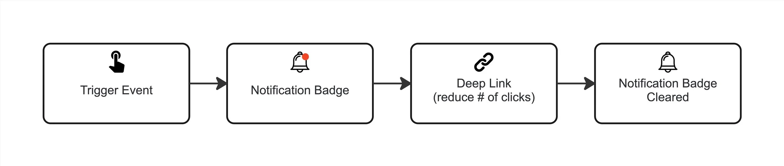
KEY FINDING. Basic logic and structure were largely the same across competitors and provided inspiration for UI elements.
The basic anatomy of a notification simplified from competitive analysis:
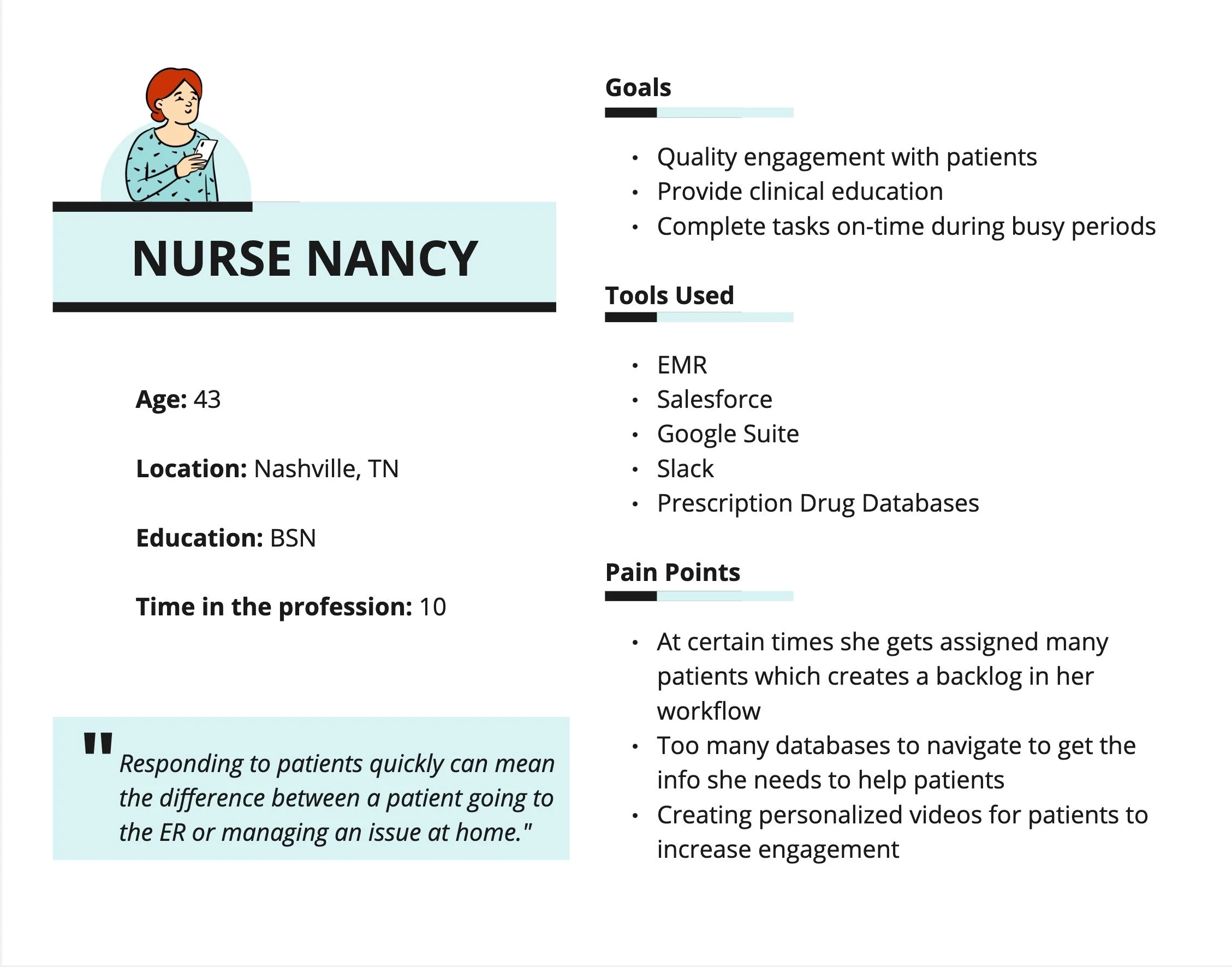
USER PERSONAS
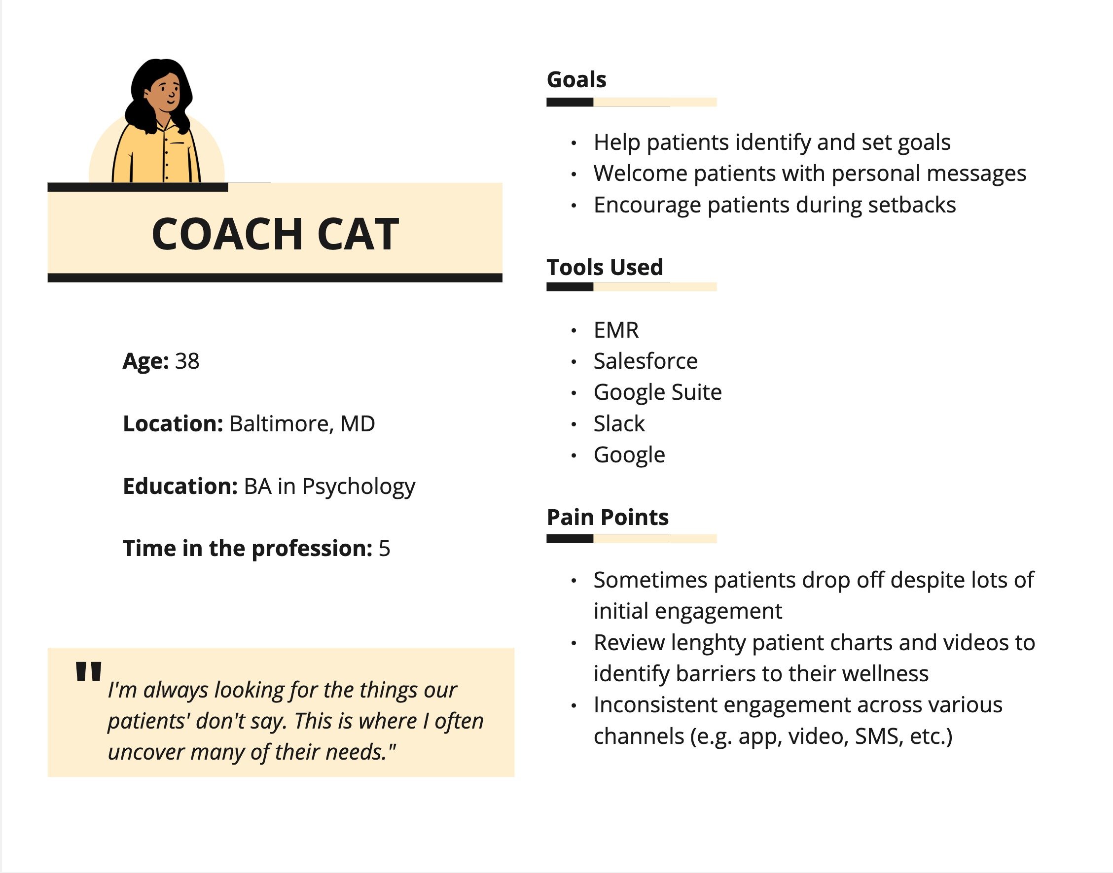
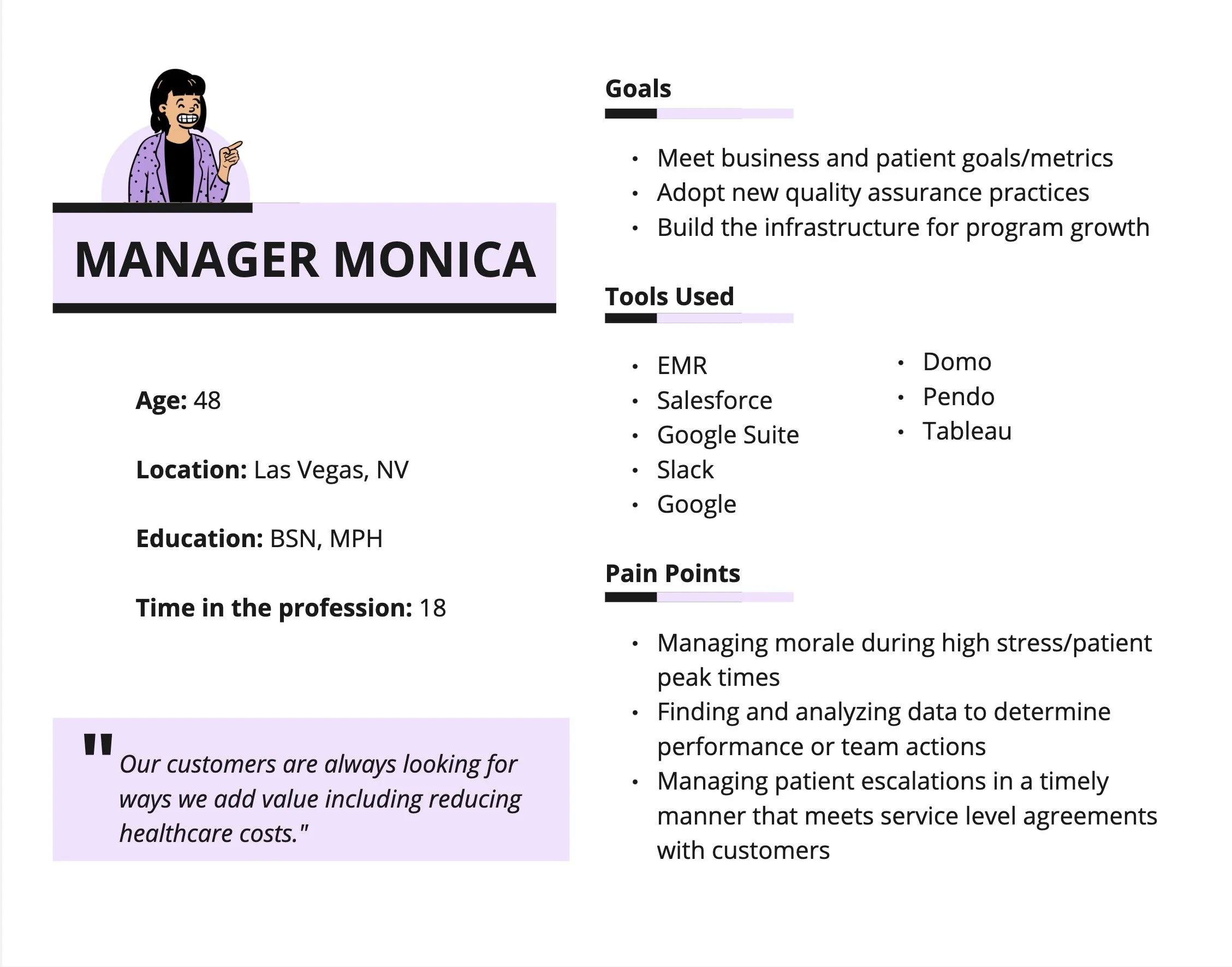
KEY CONSIDERATION. We needed to balance the needs of all types of users with our business goals to (1) improve care team response times and (2) increase patient satisfaction and care outcomes.
DESIGN PROCESS
FEATURE SET PRIORITIZATION
-
Design an interface where users can view most recent notifications from any screen in the EMR.
Business Impact:
Reduce clinician response times and improve personalization
-
Identify key notification triggers, map flows, and define deep links to guide users to the necessary action in the fewest clicks possible.
Business Impact:
Improve clinician efficiency
-
Design a dashboard interface where users can manage all current and previous notifications.
Business Impact:
Improve patient escalation response time
Increase patient conversation and engagemen
-
Design a way users can mute/unmute certain notifications
Business Impact:
Improve clinician efficiency
P0: Critical (must design/implement)
P1: High Priority,
P2: Deprioritized (nice to have)
USER FLOWS
KEY DESIGN DECISION. User flows were closely aligned to existing workflows to avoid clinicians developing completely new ways of working.

WIREFRAMES & TESTING
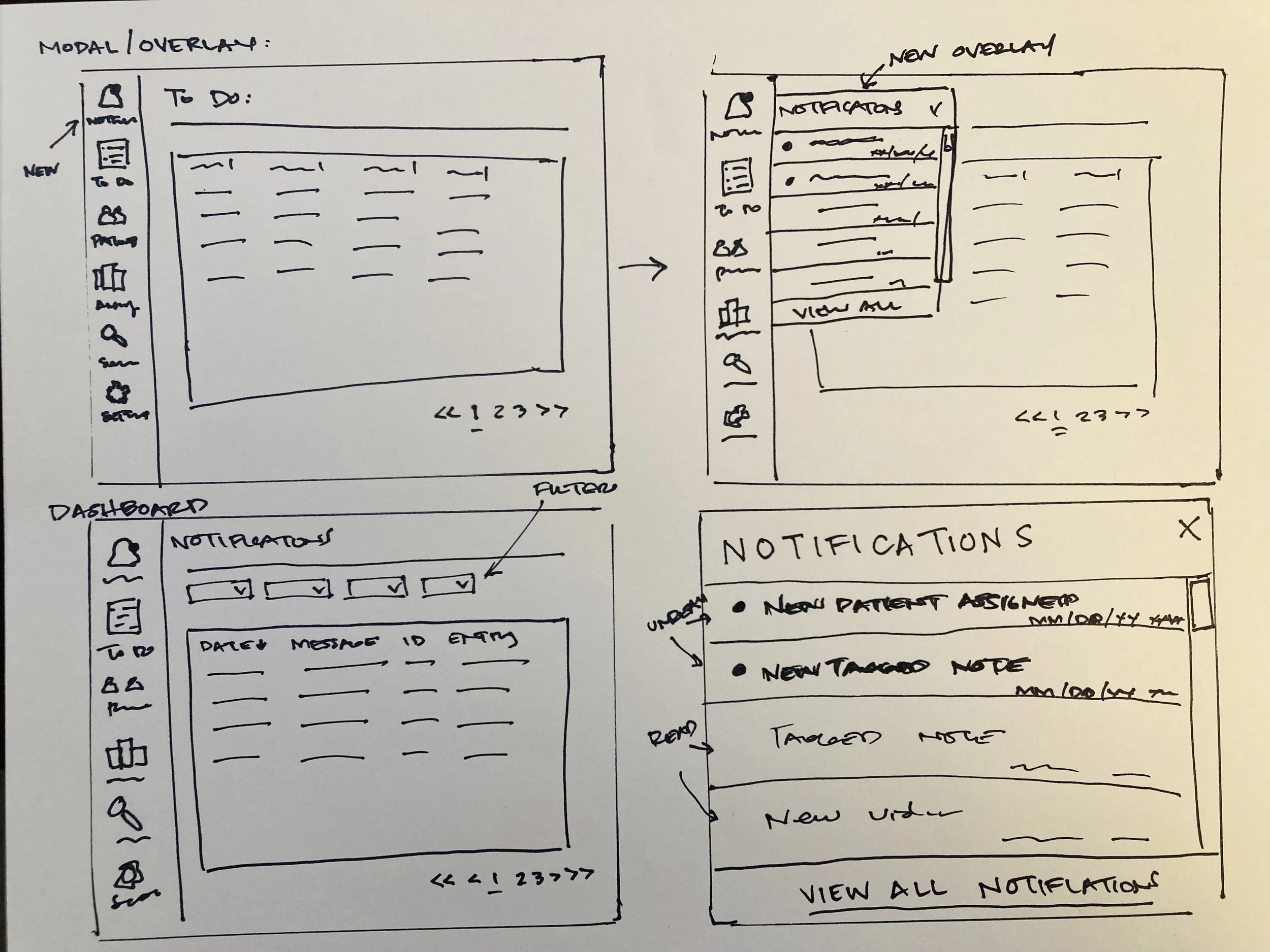
Low fidelity sketches
Mid fidelity wireframes (used for testing)
KEY DESIGN DECISION. Testing uncovered new user desires that influenced UI elements that required collaboration and negotiation with engineering and product to determine technical feasibility.
FINAL DESIGN DELIVERABLES
Notifications Modal/Overlay
An overlay that was displayable when clicked from the main menu. The functions of the modal needed to remain simple given that it was displayed over the user’s active window. The goal was for it serve as a "quick-view” that they can choose to explore further or come back later.
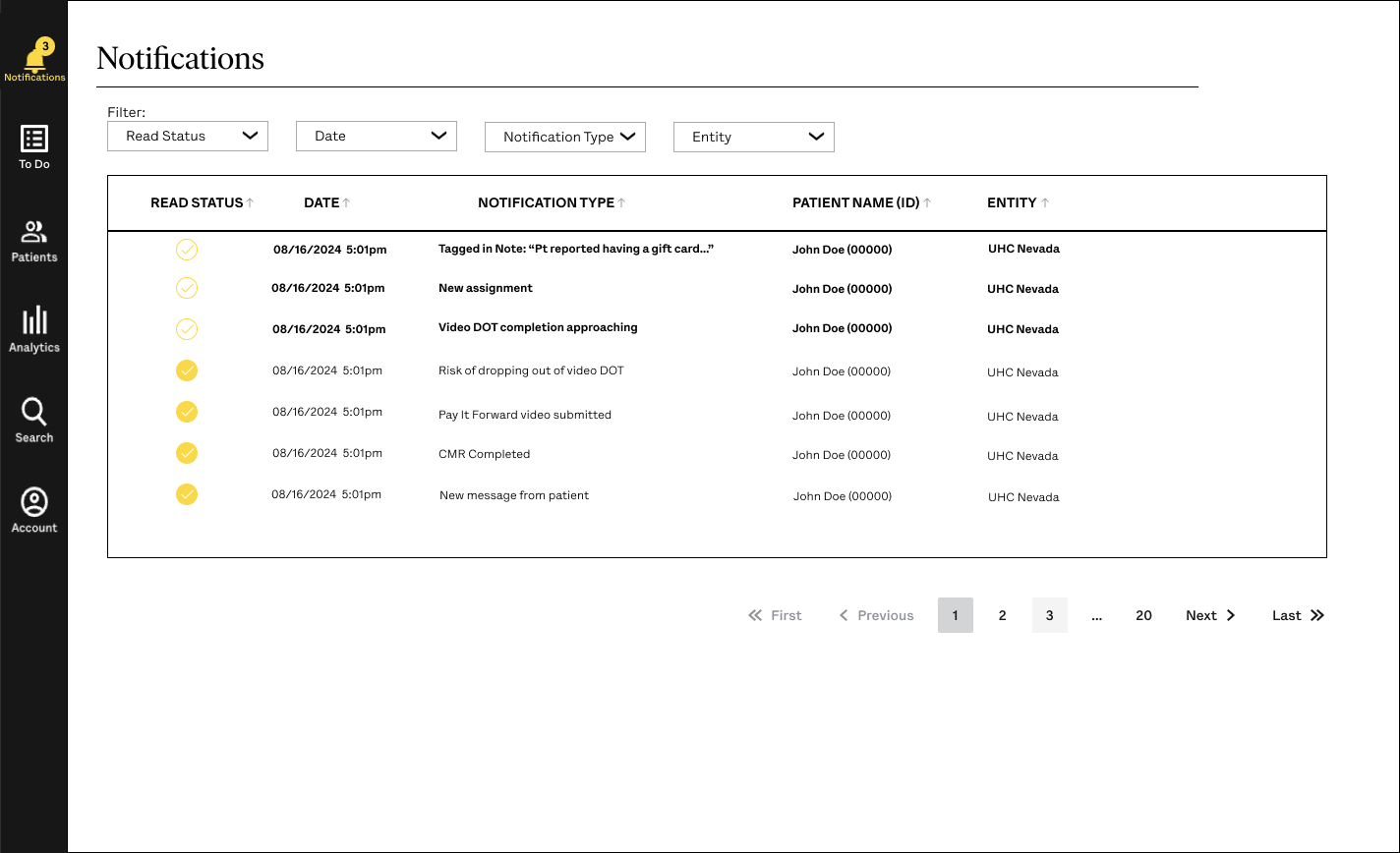
Notifications Dashboard
Users needed a central location to manage and organize notifications (as opposed to them disappearing altogether). The dashboard needed to have the functionality to sort, filter, and mark as read/unread. The UI needed to be both familiar and easy to learn.
We were able to design and hand-off this feature on-time which helped meet the key objectives and goals of several teams.
This project allowed to build rapport with several stakeholders including our care team, engineers, and product manager. As a small design team, I also had the opportunity to contribute to our design system by adding new components and documenting appropriate uses accordingly.
Next Steps:
Add additional functionality to the notifications feature. Functions on user wishlists included being able to mute/unmute specific types of notifications.
Build pathways for new triggers. I designed the feature to be scaleable in order for us to quickly add new notification triggers in the future.

